Case study
Luxury at Your Fingertips: Redesigning the David Yurman Mobile Shopping Experience
Prototyping an Intuitive, Elegant App to Enhance the Jewelry Shopping Journey


overview
About David Yurman
David Yurman is internationally recognized as America’s leading fine jewelry and timepiece brand. Artistic inspiration is the driving force behind the company’s success. David and Sybil Yurman are both artists with respected careers in sculpture and painting. We were asked to provide some UX consultancy on creating a mobile application to explore a company's products. The company hasn't had any sort of mobile or tablet application prior and wanted to expand their knowledge on what the possibilities looked like in the mobile realm to help meet their current customer’s needs and attract new potential customers. Our client had very limited time which unfortunately set the scope was only a month. To fully develop and deliver an optimal user experience, we knew the best approach to solve for this without too much constraint was to build a prototype that felt and acted like a real mobile application. This would allow us to assure we were providing a product to an accurate target audience, before moving into development given the time commitment.
We decided that the best approach was to run an internal workshop and invite a bunch of our consultants along to critique the site as we looked at each of the designs. This identified loads of issues in a short period of time.
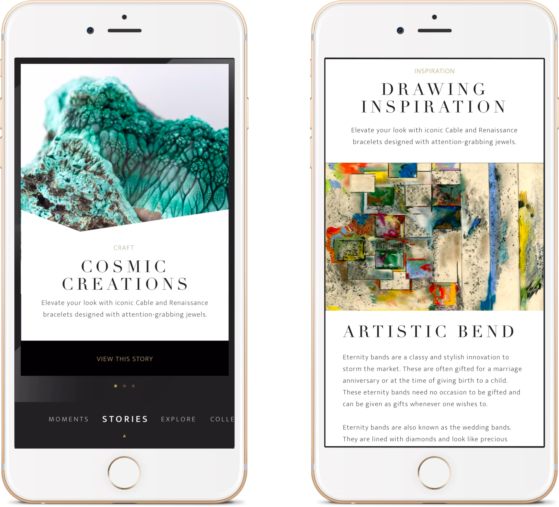
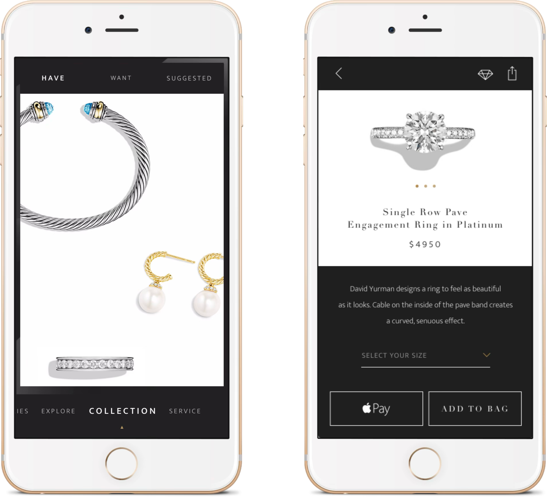
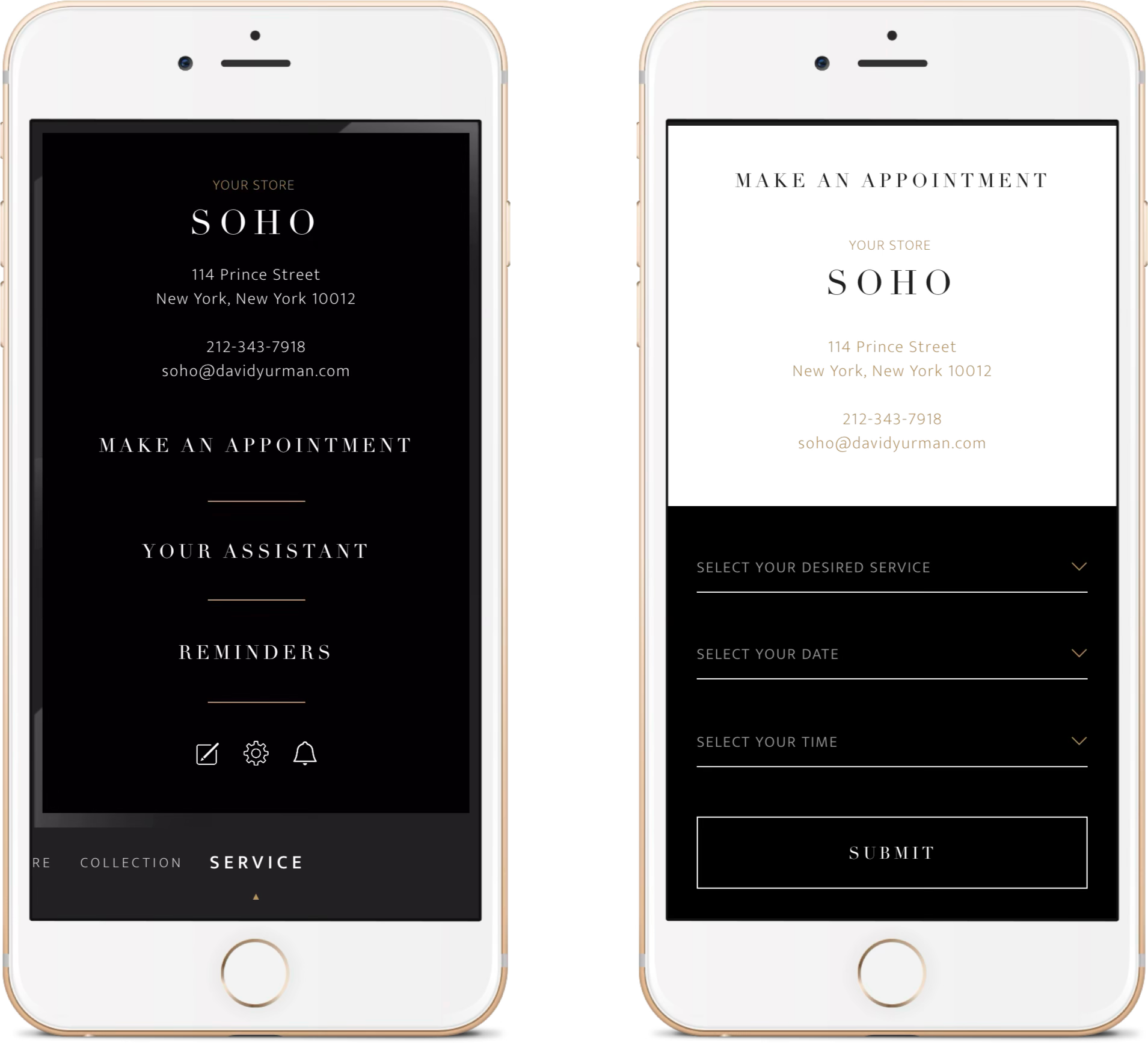
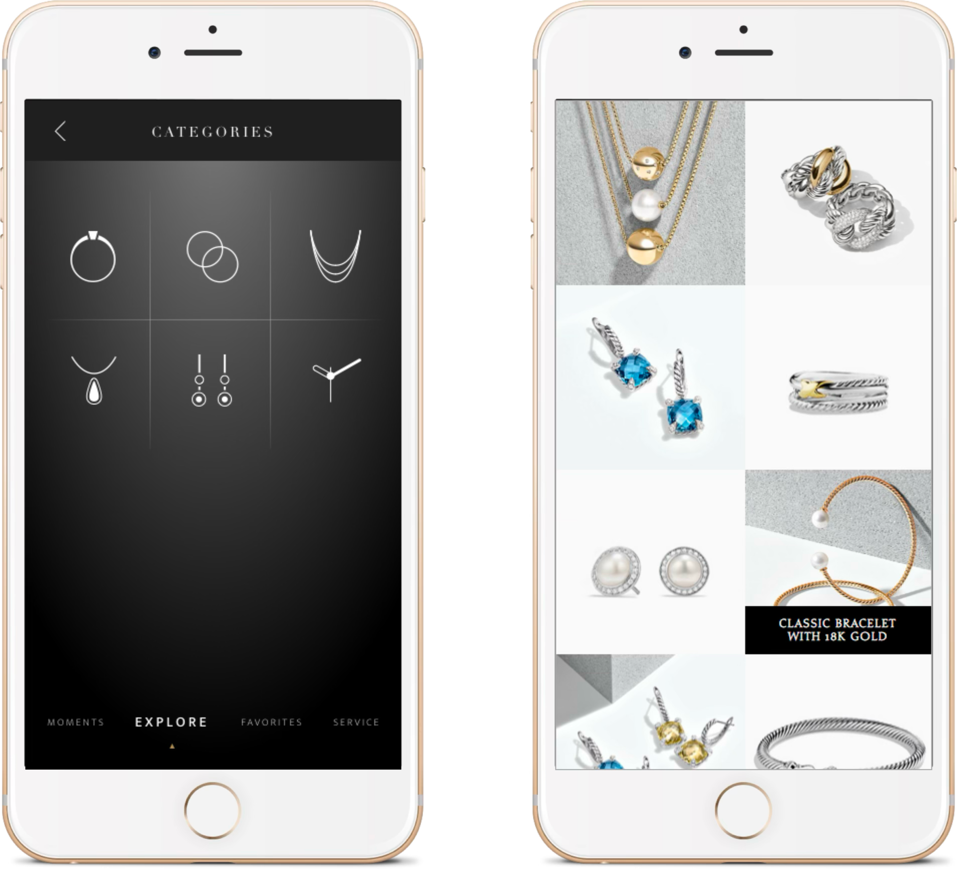
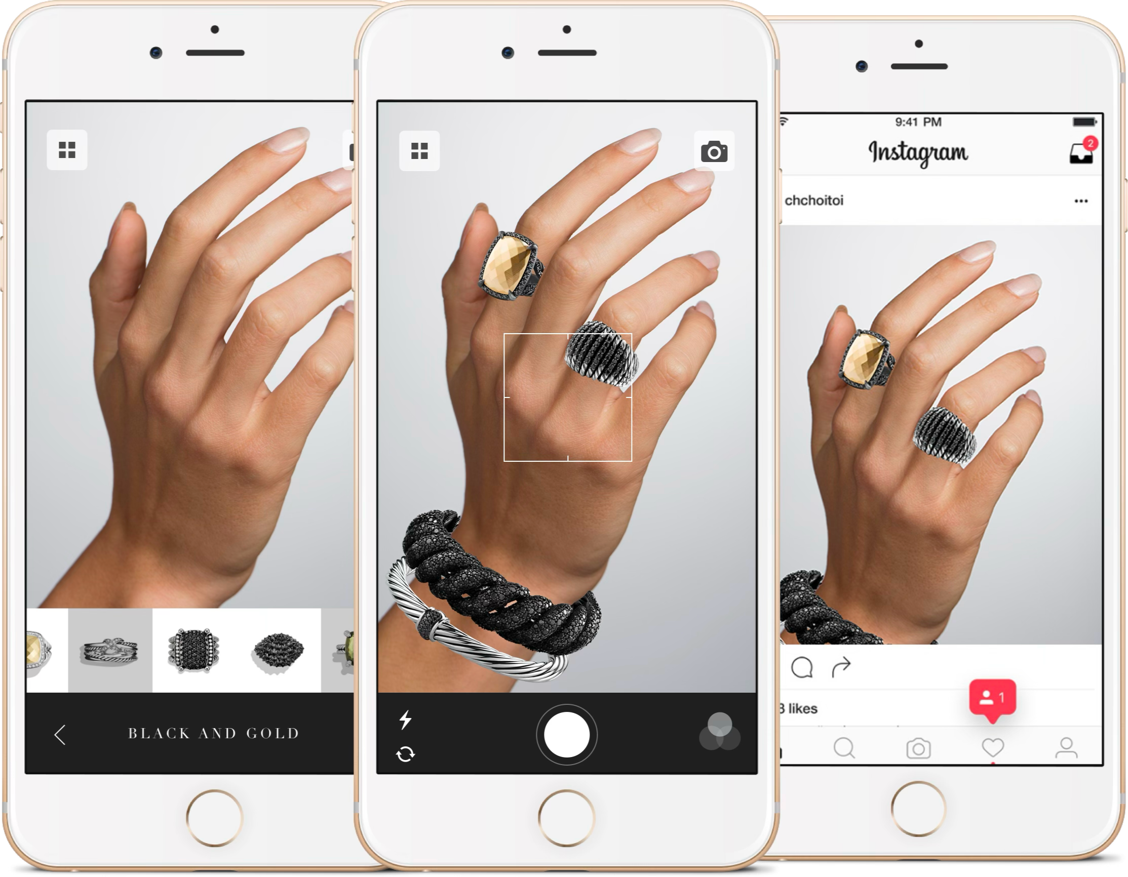
We planned a project that spent time at the beginning on understanding user’s tasks. First, we ran stakeholder interviews to build a picture of the organization and its needs from the new website. We conducted a whitespace mobile opportunity workshop. This particular organization had a large number of stakeholders and we were able to make them all feel heard. We also took time to make sure we surveyed the competitive mobile luxury landscape. We were able to come out of the workshops with Identified business objectives and a target audience for mobile app. We also generated and prioritized ideas for a differentiated mobile experience. Below you can see some examples of the prototype we created to showcase the vision:
Enim eu turpis egestas pretium aenean pharetra. Dui accumsan sit amet nulla facilisi morbi tempus iaculis. Eu ultrices vitae auctor eu augue. Sed turpis tincidunt id aliquet risus Purus in massa tempor nec feugiat nisl pretium fusce. Feugiat vivamus at augue eget arcu dictum. Gravida quis blandit turpis cursus in hac habitasse platea dictumst.
Finalize the project
Id nibh tortor id aliquet lectus proin nibh nisl condimentum. Habitant morbi tristique senectus et. Lectus urna duis convallis convallis tellus id interdum velit laoreet.
Enim eu turpis egestas pretium aenean pharetra. Dui accumsan sit amet nulla facilisi mor tempu iaculis. Eu ultrices vitae auctor eu augue. Sed turpis tincidunt id aliquet risus Purus in massa tempor nec feugiat nisl pretium fusce. Feugiat vivamus at augue eget arcu dictum. Gravida quis blandit turpis cursus in hac habitasse platea dictumst.
Result
Final Result
Id nibh tortor id aliquet lectus proin nibh nisl condimentum. Habitant morbi tristique senectus et. Lectus urna duis convallis convallis tellus id interdum velit laoreet.
Content creators and human resources personnel are able to seamlessly update the website through graphical interfaces, and the site simply rebuilds itself along with search engine indexes as the OpenWeb team continues to create.
Enim eu turpis egestas pretium aenean pharetra. Dui accumsan sit amet nulla facilisi mor tempu iaculis. Eu ultrices vitae auctor eu augue. Sed turpis tincidunt id aliquet risus Purus in massa tempor nec feugiat nisl pretium fusce. Feugiat vivamus at augue eget arcu dictum. Gravida quis blandit turpis cursus in hac habitasse platea dictumst.
overview
Background
In a previous project for a leading healthcare app, our goal was to improve the user experience for patients booking appointments and managing medical records. The client had an outdated interface that led to user frustration, especially for older patients. As the UX lead, I was responsible for a complete overhaul of the user flow, ensuring accessibility and ease of use while aligning with regulatory standards.


overview
Project Overview
Our scope included a full audit of the existing digital assets, user journey mapping, wireframe development, usability testing, and iterative design revisions. The project had a six-month timeline and involved multiple stakeholders, including healthcare professionals, legal teams, and patient advocacy groups.
overview
Sitemap
The sitemap was reorganized to create a more logical flow, with a focus on task-based navigation. Key features like appointments, medical records, and messages were made accessible from the main dashboard.

overview
The Challenge
The key challenge was the complexity of the healthcare system. We needed to simplify medical jargon, reduce cognitive load for users, and ensure the design was intuitive for a wide range of users, from tech-savvy millennials to older adults who were less familiar with digital interfaces.

overview
The Audience
The primary audience consisted of patients aged 30–65, many of whom had chronic conditions requiring regular appointments. Additionally, we had to consider healthcare providers who would use the system to manage patient data. The design needed to cater to both patient and provider needs without overwhelming either group.
overview
Project Process
Our research included user interviews, contextual inquiries, and a comprehensive content audit of the existing system. We identified pain points like long load times, confusing navigation, and inconsistent information presentation across devices.

overview
Project Process
We followed a user-centered design process, beginning with in-depth research and ending with multiple rounds of testing and iterations. Collaboration with the client’s IT, legal, and medical teams was essential throughout the process.
overview
Research
Our research included user interviews, contextual inquiries, and a comprehensive content audit of the existing system. We identified pain points like long load times, confusing navigation, and inconsistent information presentation across devices.
overview
Problem Statement
Patients struggled to find relevant information and complete tasks like booking appointments or accessing medical records. These issues led to high abandonment rates and frustrated users who often reverted to traditional phone bookings.

overview
Ideation
We brainstormed multiple design solutions, including simplifying the navigation, introducing a prominent “Next Appointment” feature, and improving the search function for medical records. The team sketched initial wireframes and discussed various interaction models that could solve the identified problems.
overview
Testing
Based on user feedback, we iterated the design several times, making adjustments to the user flow, adding tooltips for guidance, and improving error messaging. These iterations continued until users consistently completed tasks without confusion.
overview
Iterations
Based on user feedback, we iterated the design several times, making adjustments to the user flow, adding tooltips for guidance, and improving error messaging. These iterations continued until users consistently completed tasks without confusion.

overview
Design
The final design emphasized a clean, minimalist interface with clear calls to action. We used larger text, ample white space, and intuitive icons to improve accessibility. The navigation was simplified to a top-level menu, reducing the number of clicks needed to access key features.
overview
Outcomes & Reflections
The redesigned app significantly reduced task completion time for booking appointments and accessing medical records. Feedback from patients and providers was overwhelmingly positive, especially regarding the system’s improved usability and clarity.

overview
Results
After the launch, user satisfaction scores improved by 35%, and the app saw a 20% reduction in appointment booking times. The client reported fewer calls to support for basic tasks, indicating the new design was more intuitive.

overview
Reflections
This project reinforced the importance of continuous user testing and iteration. While our initial design concepts were promising, the final product’s success was driven by iterative improvements based on real user feedback.

overview
Task Flow
We redefined the task flow for booking appointments, reducing the process from five steps to three. This simplified flow allowed users to quickly view available time slots, confirm their selection, and receive confirmation with minimal friction.

overview
Personas
We developed two primary personas: “Busy Parent” and “Chronic Condition Patient.” These personas helped us focus on distinct user needs, such as managing multiple family appointments or tracking long-term health data.

overview
User Interviews
We interviewed 15 users across a range of demographics to understand their needs, frustrations, and daily habits. These interviews provided the foundation for our design decisions and ensured we were solving real user problems.

overview
Workshop
We hosted a design thinking workshop with key stakeholders, including healthcare providers and IT staff, to brainstorm solutions. This collaborative approach helped align everyone’s vision and contributed to the overall success of the project.

overview
Contextual Inquiry
Contextual inquiries involved observing patients using the existing app in real-world scenarios, such as booking appointments while juggling daily responsibilities. This revealed pain points that weren't immediately obvious through interviews alone.

overview
Wireframes
We created low-fidelity wireframes for initial feedback and high-fidelity versions for usability testing. The wireframes allowed us to quickly iterate on the design before moving into full development.

